|
|
|
Margot Schulzke’s name and her work are well known coast to coast. A contributing editor for The Pastel Journal, she is widely regarded as an authority on the subject of composition and design. Her upcoming book, A Painter’s Guide to Design and Composition (Northlight) will be out January 2006. The highly-regarded Pastel Society of the West Coast ranks her as a Distinguished Pastelist, an honor extended to only 26 of PSWC’s approximately 4 members. Her work has been featured in a number of books and articles, a list of which appears below. She has served as a juror for many exhibitions, such as Pastels USA (2003) and Pastels 100 (2004).
Where Art IS
--- © Margot Schulzke, 2002
First, a reprise.
In the March-April 2002 issue of the Pastel Journal, we discussed when art “isn't,” in reference to what nationally syndicated columnist William Rusher calls the “grim and determined iconoclasm” of 20th century art. He notes, “In almost every discipline familiar to the human mind, traditional wisdom and accepted standards have been overthrown in the name of 'progress'. …In literature, deconstructionists have denied that acknowledged masterworks can have any objective meaning.” [1] An intriguing example of the latter is the removal of William Shakespeare from the curriculum of some college literature departments. One of the most stunning (cited in detail in the last issue) was the media's studied neglect of Frederick Hart's Ex Nihilo, his superb, two-story tall bas-relief sculpture adorning the west end of Washington's National Cathedral.
In the same sense that Shakespearean literature has ceased to exist in miscreant English departments, fine art in the traditional sense has been eliminated-in an absolutely physical sense - from art departments operating under the same philosophy. For more than a score of years on many campuses, design instruction has been relegated to the interior design department, and in one instance of which this writer is aware, to the home economics department. For those of us blessed - or cursed - with a perverse sense of humor, the whole scene would be laughable, if it weren't for the fact that since the late fifties, two generations of artists and art teachers have been handicapped in the process.
James F. Cooper, editor of American Arts Quarterly, observes, “...the very concept of transcendence is under attack. The present cultural decline is far more serious than the proliferation of more bad art. The arts contain the core values of civilization. Without the sensory perceptions that gifted artists and poets alone can provide, civilization loses its ability to see.” [2]
A stunning commentary-with two levels of meaning. Are the arts merely a reflection of the society as is often alleged, or does the influence run in both directions? It is that question of the two-way mirror, which we discussed in some detail in the last issue.
The second meaning is less lofty ethically, but of great importance aesthetically. What makes art fine … or, as Cooper describes it, transcendent? What is transcendence? It is, according to Webster, is to rise above, going beyond the limits, surpassing. How do we rise above the cynical, the tawdry, the commercial and the cute, to reach the level of transcendent or fine art?
Perhaps the first item to consider is our motive in creating a work of art. If it is legitimately fine art, I submit that the first and dominant consideration, the motivating force, must be aesthetic. Art should be-yesterday, now and forever-for art's sake.
That leads us to authenticity, or artistic passion. A small child's artwork, if created spontaneously, is indisputably authentic. It is natural, spoken from the heart or the gut, as you choose. There are few of us who do not recognize the power in children's art. Likewise, when an understanding of design, drawing and technique become intuitive or natural to the adult artist, and the artist is creating to meet his own aesthetic standards, authentic artistic expression follows.
A fine example of such authenticity and passion is seen in Dawn Emerson's series of horse studies, one of which is reproduced here, All Charged Up. She observes, “It is not the likeness of each of these horses I try to capture, but that feeling of energy and aliveness that is so thrilling to witness in the wild.”
Dawn talks about how involved she becomes as she paints. “My studio becomes very much a theater. The easel is the stage, and I am the director. Music from my cranked up CD player fills the space to create the mood and energy. …If I am using a photo taken in the field… the sounds, smells, light, and texture of the environment come back to me along with the emotion of the moment. I have caught myself more than once checking to see if anyone else is sharing my experience, but of course, no one is. I am alone in the studio, recreating the fabric of a memory or an image, and being transported by the experience.”
A sensitive viewer should be able to feel the artist's involvement in creating the work. Such involvement suggests respect for the intellect of the intended audience. Or does the work talk down to its viewers, as some highly commercial work does? Is it the real thing, or the emperor's new clothes? Such perceptions in regard to a particular work may vary from one viewer to another, but the artist will know his/her original intent. And a significant number of viewers will sense it. If we don't feel intensely about a subject, perhaps we should leave it to someone else to paint.
When aesthetic considerations take a back seat to sentimentalism, commercialism, titillation, story-telling, or a political agenda-and the conveyance of a didactic message dominates, the quality of the work nearly always suffers. What purports to be art may become hucksterism (either political or commercial), voyeurism, or mere illustration. We don't have to look far to find examples.
However, the application to political messages is a delicate matter. No one would accuse Goya, in his Disasters of War, of not creating fine art, even though this body of work was done with a clearly political motive. The same applies to Daumier's depictions of the brutality of the French Revolution. Again, the question revolves around authenticity. Both of these artists were creating from profound artistic understandings as well as from their raw, truthful feelings. They were not peddling to a trendy market.
Obviously most artists want to paint work that sells. But hopefully, the work sells because it is superior in quality, not because it is a publicity stunt, nor because it serves as a water-boy for sentimentalism or other content that dominates or interferes with aesthetic impact.
The matter of concept is perhaps next in order. Concept pertains to the aesthetic approach the artist takes to the subject matter. It describes how the content will be treated aesthetically. Perhaps the intended concept is to present the effects of light moving across the subject, in a left to right direction. Or it may be to use minimal color while creating the illusion of full color. Or it is an exercise in inverting the natural colors, red in place of green, etc., a concept I have applied to several landscapes. The intent may be to make the center of interest cold (blue, perhaps), and background warm-and yet make the background stay where it belongs. Concepts should be determined before the work begins and should remain in the artist's consciousness throughout the execution of the work.
Mood is affected by the concept, but it is a thing apart. It has everything to do with content. Is the tone in that landscape to be one of dusky melancholy, or will it present the last, late afternoon light suffusing everything in its path with a golden blush? The two situations are mere minutes apart on the clock, but they are light years apart in the matter of mood. A sidewalk café scene could express a holiday mood, but it could also be one of anticipation or ominous portent, depending on value scale, color, placement, and content. Is the feeling expressed by the portrait subject one of confidence and authority, or is it diffidence and sadness? Or, perhaps, will we see indications of mischieviousness? The expression of eyes and mouth are only part of the story; the set of the head on the shoulders is extremely telling. Again, this is a matter that should be determined before one goes to work-and kept in mind throughout.
Composition is a major concern, one that is often slighted, even in work that is otherwise technically fine. Serious thought should be given to the intended design scheme; it should not be an accidental development. [3] I have always hoped that in the majority of my works, the works are first abstractions, and representations a distant second. Composition before content is the applicable catch-phrase.
Among the most critical design elements is value contrast. Marbo Barnard's Warrior's Headdress includes the full range of values, lightest light to darkest dark, effectively drawing the eye across the room. It is worth noting that few artists have figured out how to successfully paint with minimal contrast, one of those being Monet. His work succeeds in spite of, not because of, his frequently narrow value range.
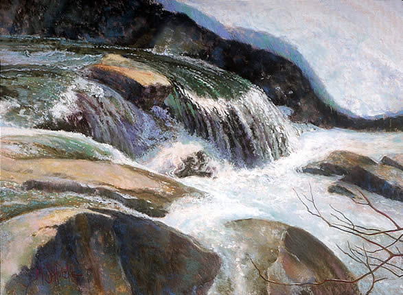
Balanced temperature is another key. A painting that is overwhelmingly warm will draw the eye, whether or not it includes cool passages. A cold painting usually will not. I try to accommodate for this in painting cooler subjects, such as dominantly green landscapes, or seascapes, by working over a warm undertone, often over reds. To make Snow Melt, South Yuba warmer, I worked over an underpainting of alizarin crimson and cadmium red light, dissolved in mineral spirits.
Interesting intervals are critical. That applies to spacing between similar shapes or rows of, say, trees or fence posts. We often hear the term a “state of pleasing decay.” What is so pleasing about decay? Usually not the rot. Some decay makes buildings interesting since roofs sag, a fence post or gate hangs loose, etc., creating more interesting intervals. Intervals also apply to the distance between values, and in scale-objects of similar shape should be unevenly spaced in terms of relative size.
Another sure sign of professionalism, or a lack of it, is the treatment of edges. They belong in the lost and found department. [4]
Avoidance of kitsch. What is kitsch? It generally includes subject matter that is trite, overworked or over-cute. I would personally include as kitsch themes that are excessively harsh and pseudo-sophisticated, but still overdone. I would lump together in this expanded category what someone has perceptively labeled ICU (intensive care unit) art, and, at the other end of the same spectrum, Thomas Kincaid and (forgive me) most teddy bears. Neither relies primarily on aesthetic qualities for their impact. ICU art relies on shock, while the second group relies heavily on sentimentality. The two are miles apart in the audiences they draw, but both are overworked. However, all subjects have “been done”, so we can't get hung up on that-a fresh approach rescues most subject matter from the dust heap.
Speaking of that, freshness is a big issue. Not only fresh subject matter, if such could be found, but fresh angles, fresh color. Clean segments of color, clean lines. Beware of the over-finished, soggy vegetable look! Allow the surface of the paper to “breathe”; covering it all takes the air away. In this connection, blending is a particular hazard. Layering pastels is usually the better way to go.
Elusiveness: Like a good whodunit, or a lady who plays hard to get, art that doesn't reveal all at first glance is much more interesting over a longer period of time. Leaving viewers some guessing to do encourages them to stick around longer. As with Rembrandt's shadows, which tell blessed little but suggest a lot - beguiling us in the process - we like to linger over a painting that is full of innuendo.
Does this short article cover the subject of transcendence? Obviously not. It is just an introduction, the tip of the iceberg. No wonder many art critics prefer to “only review 'the new' ”.
Knowing what one likes is sufficient to enjoy fine art, but it is not enough to critique it. Great art is, I submit, too complex to be understood by anyone but a serious practitioner. While such understanding is in reach of anyone who makes the decision to go there, it is a long commute.
---------
[1] William Rusher, Washington Times, National Weekly Edition, Sept. 21-27, 1998, p. 32.
[2] Ibid.
[3] See Composition, the Bone Structure of Painting, Margot Schulzke, Pastel Journal, Jan-Feb. 2002.
[4] See On the Edge, Margot Schulzke, Pastel Journal, Jan/Feb 2000.
|